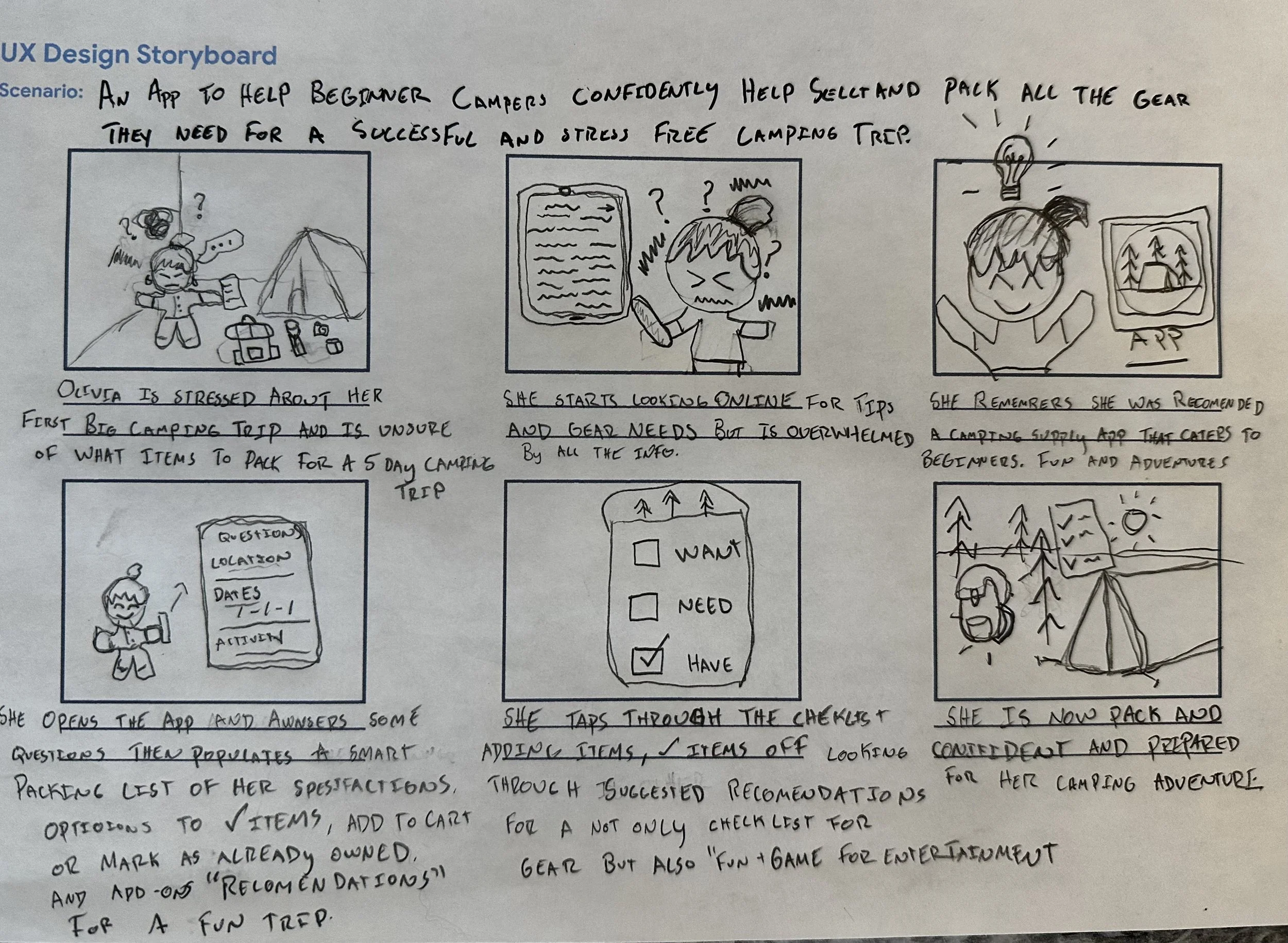
A camping supply app for beginner campers
Empowering beginners with simple gear shopping, curated bundles, and stress-free trip planning
Project Overview
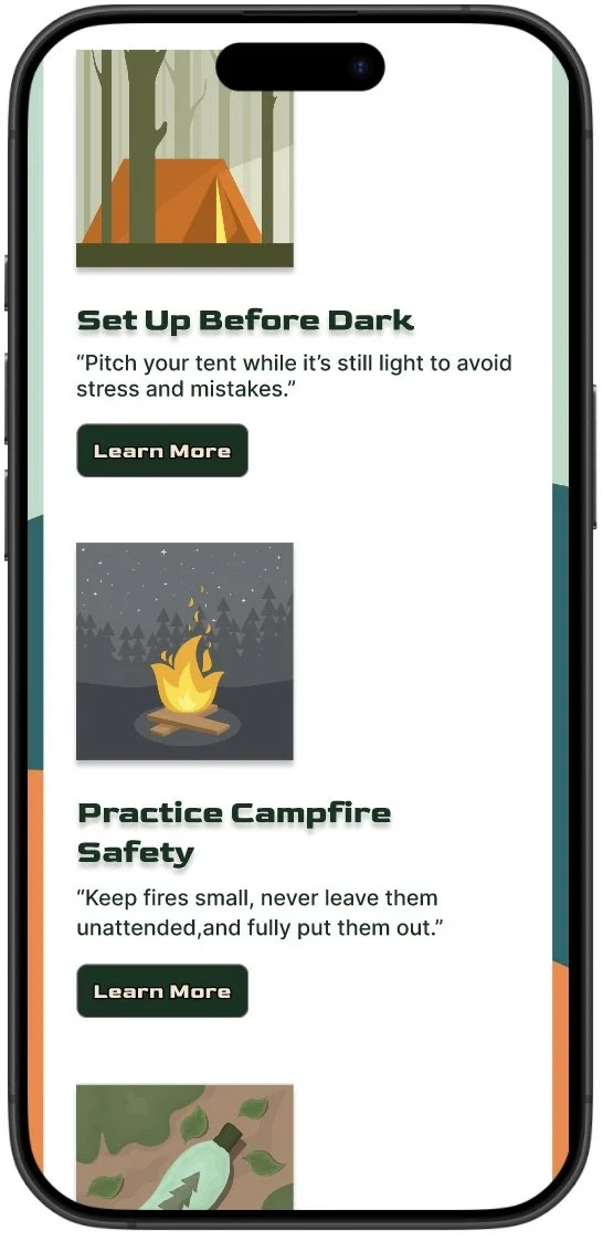
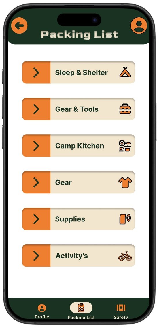
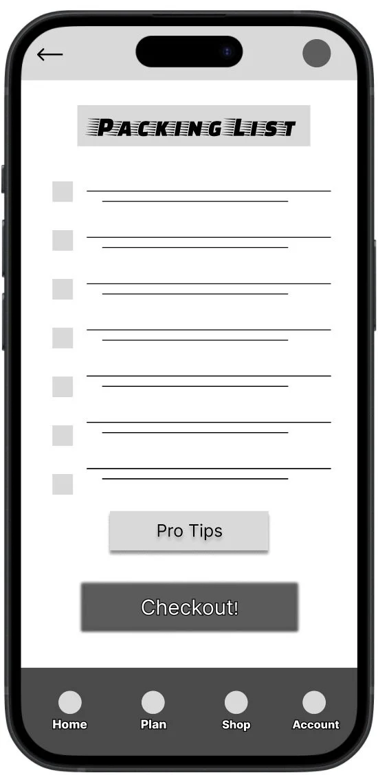
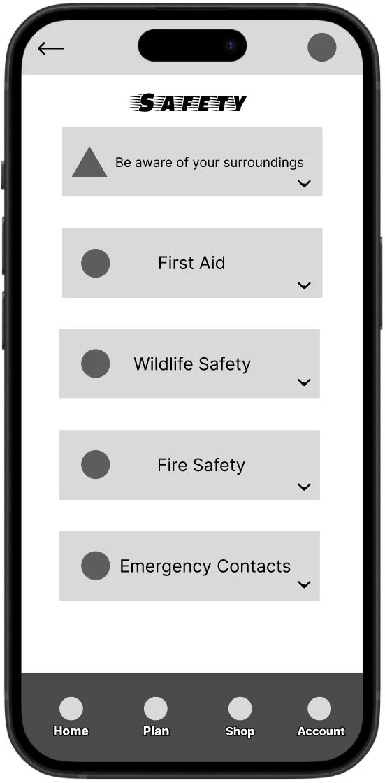
CampMate is a beginner-friendly camping supply and trip-planning app that helps new campers choose the right gear, build packing lists, and plan safe trips with confidence. It includes a guided 5 question quiz, curated gear bundles, a customizable packing list, and clear safety tips.
Role & Tools
Role: UX Designer & Researcher
Tools: Figma, Miro, Google Forms, Zoom
Timeline: July 2025 - September 2025
The goal
Design an intuitive mobile experience that helps beginner campers find gear, complete a personalized quiz, create packing lists, and access safety tips so they can plan trips with confidence.
The problem
Beginner campers often feel overwhelmed by cluttered gear sites, unclear information, and confusing navigation. They need a simple trustworthy way to discover what to bring and how to prepare.
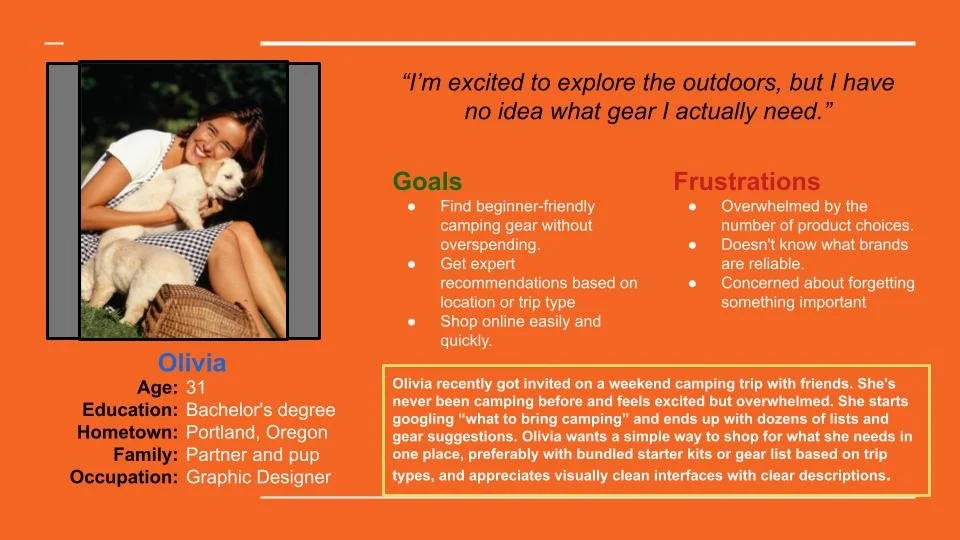
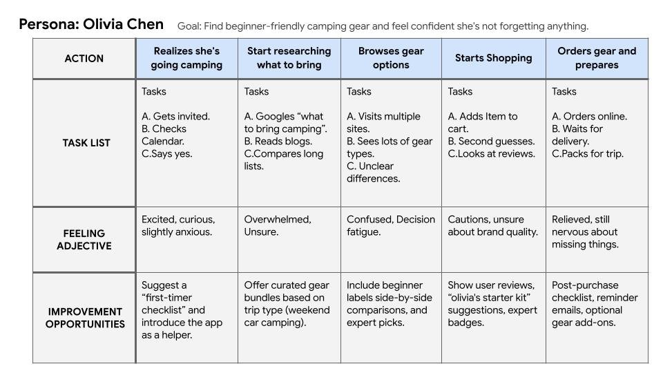
Research snapshot
I conducted two rounds of moderated remote usability tests with beginner and intermediate campers (5 participants each). Research focused on task success for the quiz, shopping, and packing list flows, and measured KPI’s like task success rate, time on task, and SUS scores. Key activities: interviews, surveys, affinity mapping, low-fi testing, and iterative validation.
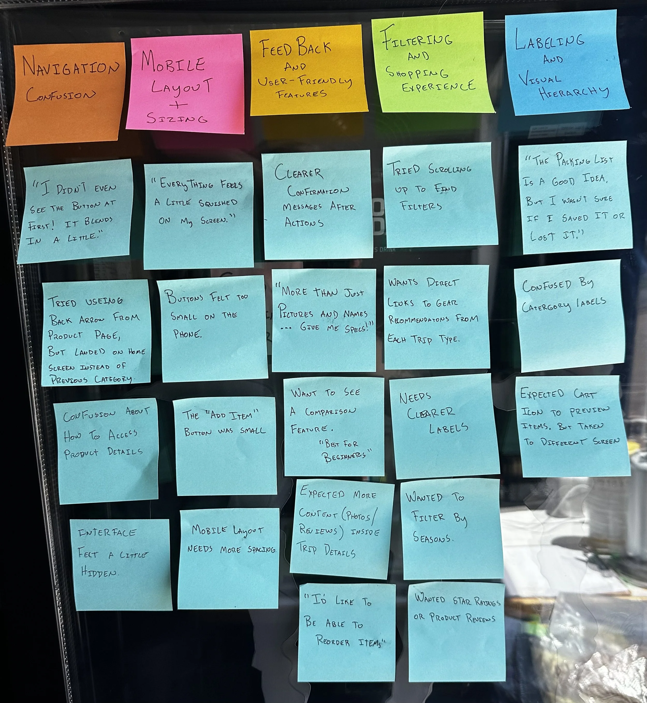
Usability findings - Round 1
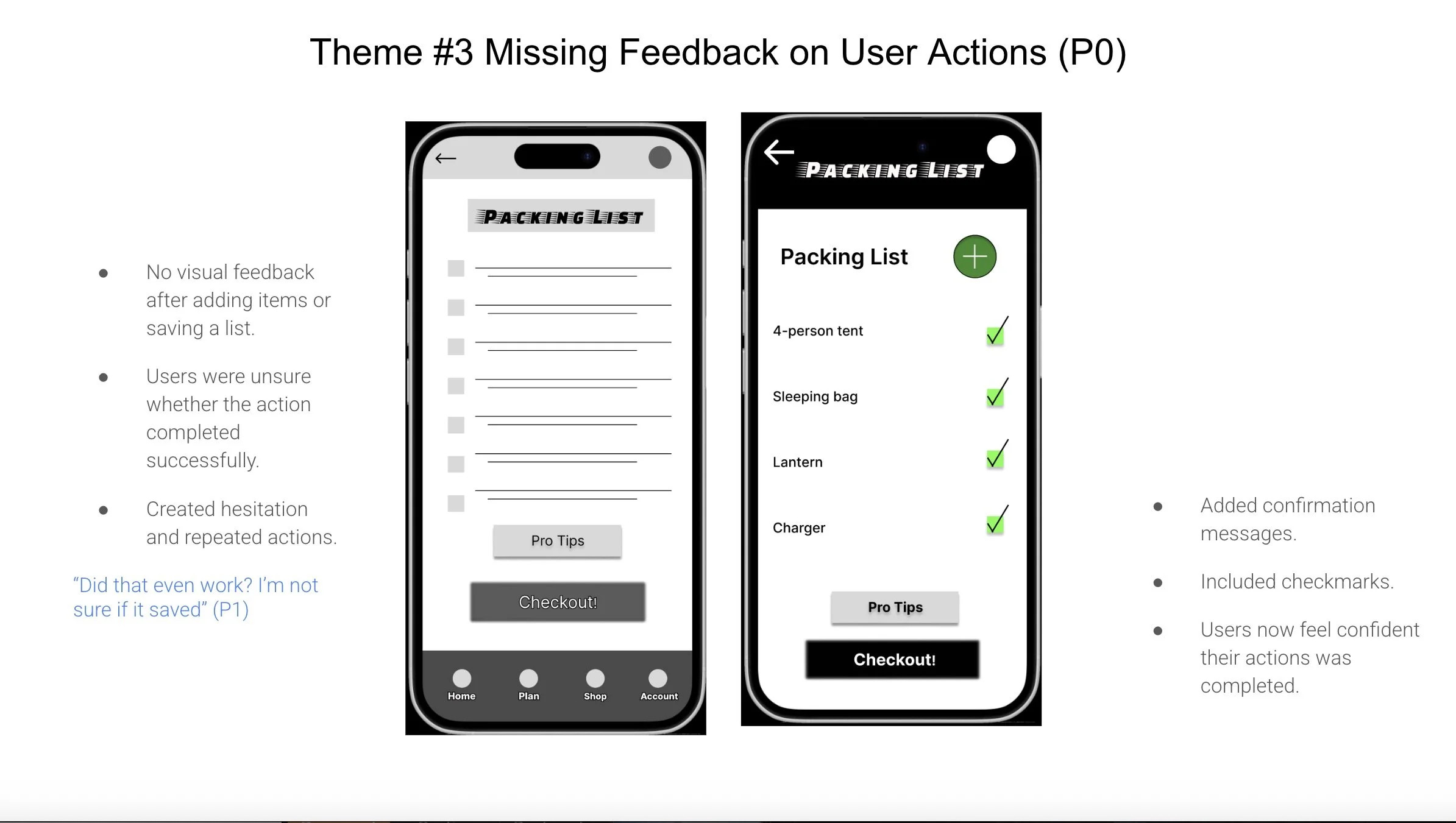
Navigation confusion: Users missed key buttons (Add item, back arrow).
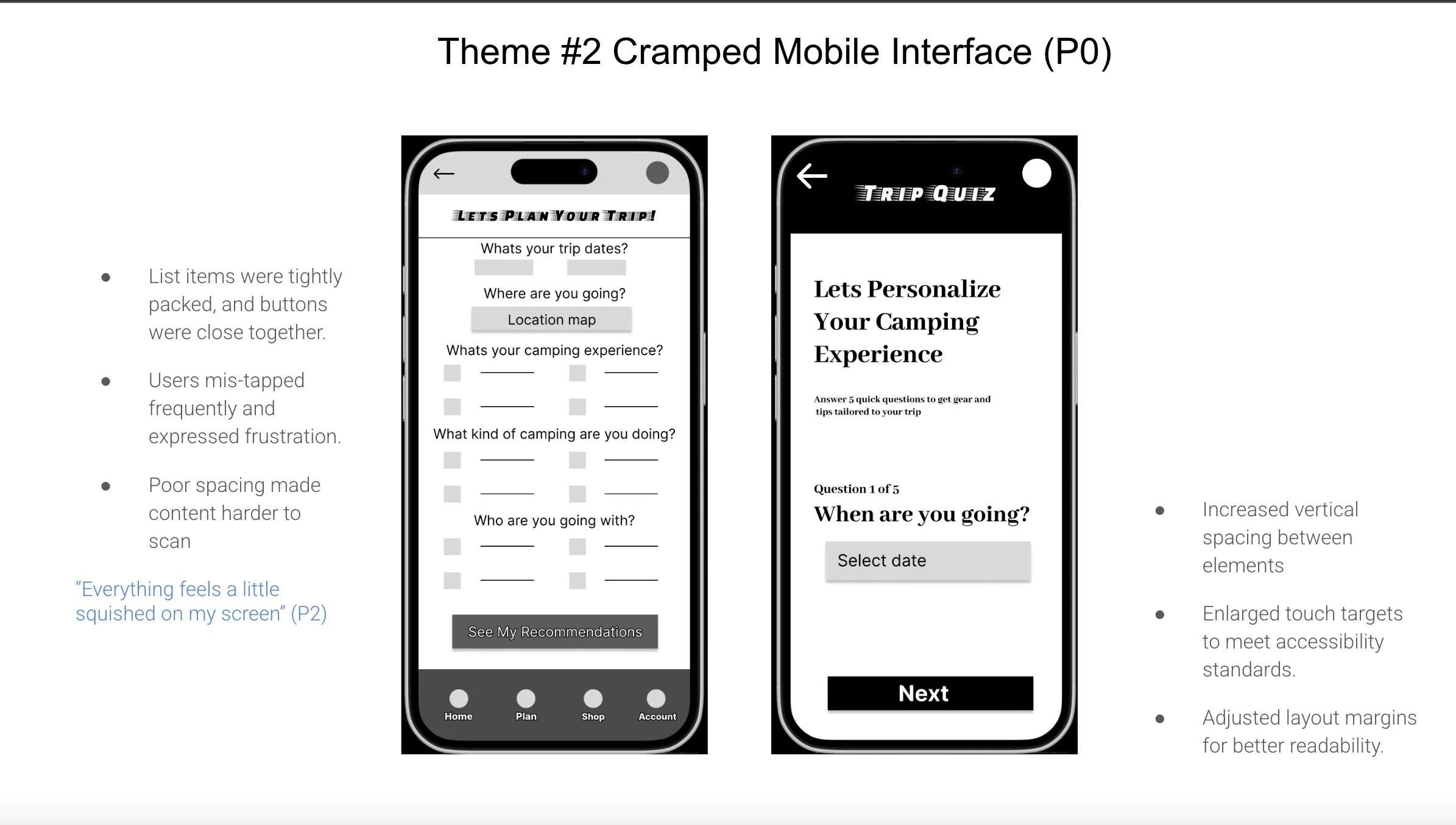
Cramped mobile layout: Small tap targets and tight spacing caused mis-taps.
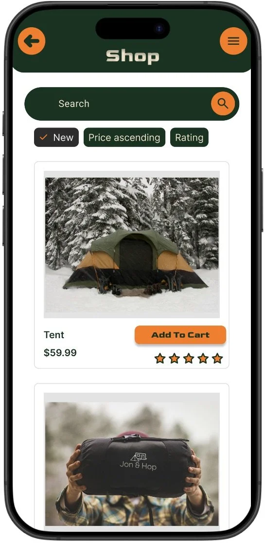
Insufficient product detail: Users wanted specs, reviews, and photos to decide.
Usability findings - Round 2
Entry clarity needed: Users didnt always notice the quiz entry point; clearer onboarding cues helped.
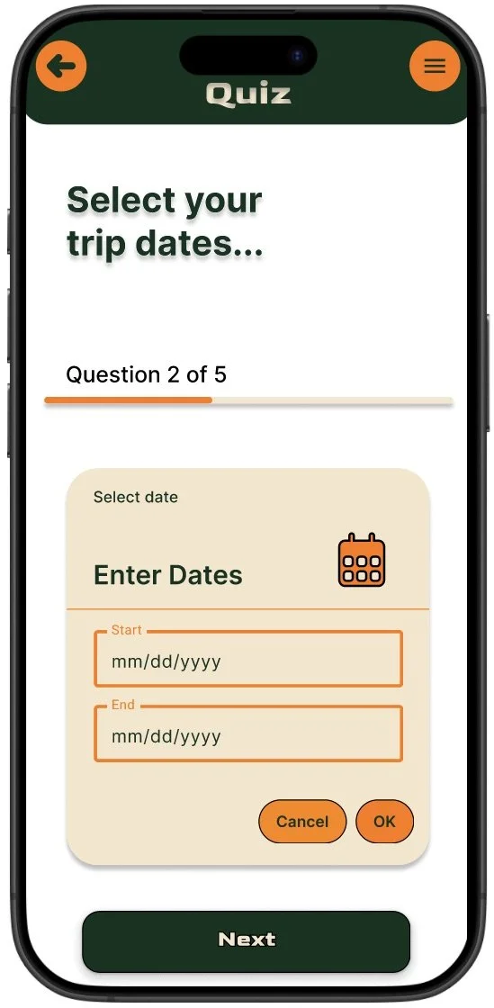
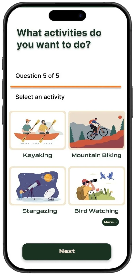
Quiz improvements: The quiz was engaging - reordering questions and making them feel more personal improved result relevance.
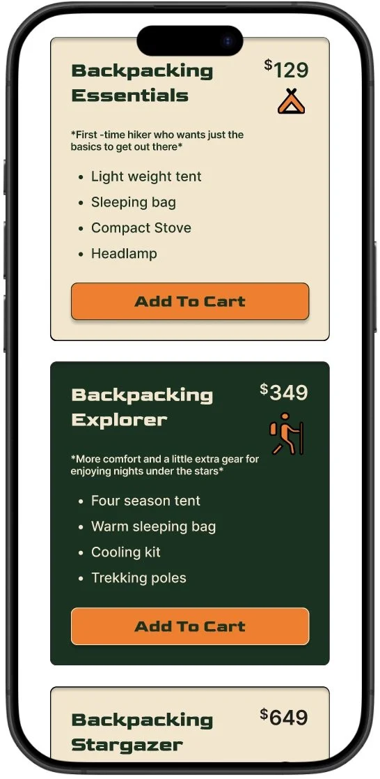
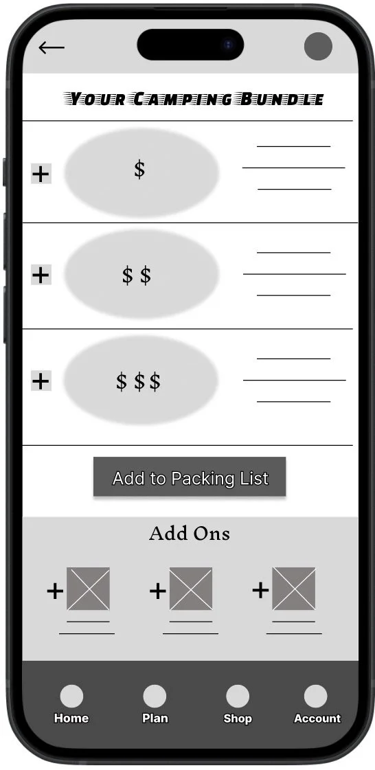
Bundles & checkout: Bundles were valued; users requested add-ons, confirmations, and reassurance during checkout.
Design process
I began with paper sketches, moved into low-fi digital wireframes focused on clear entry points (“Take the Quiz” vs. “Shop Gear”), then prototyped the packing list and bundle flows to validate the core experience.
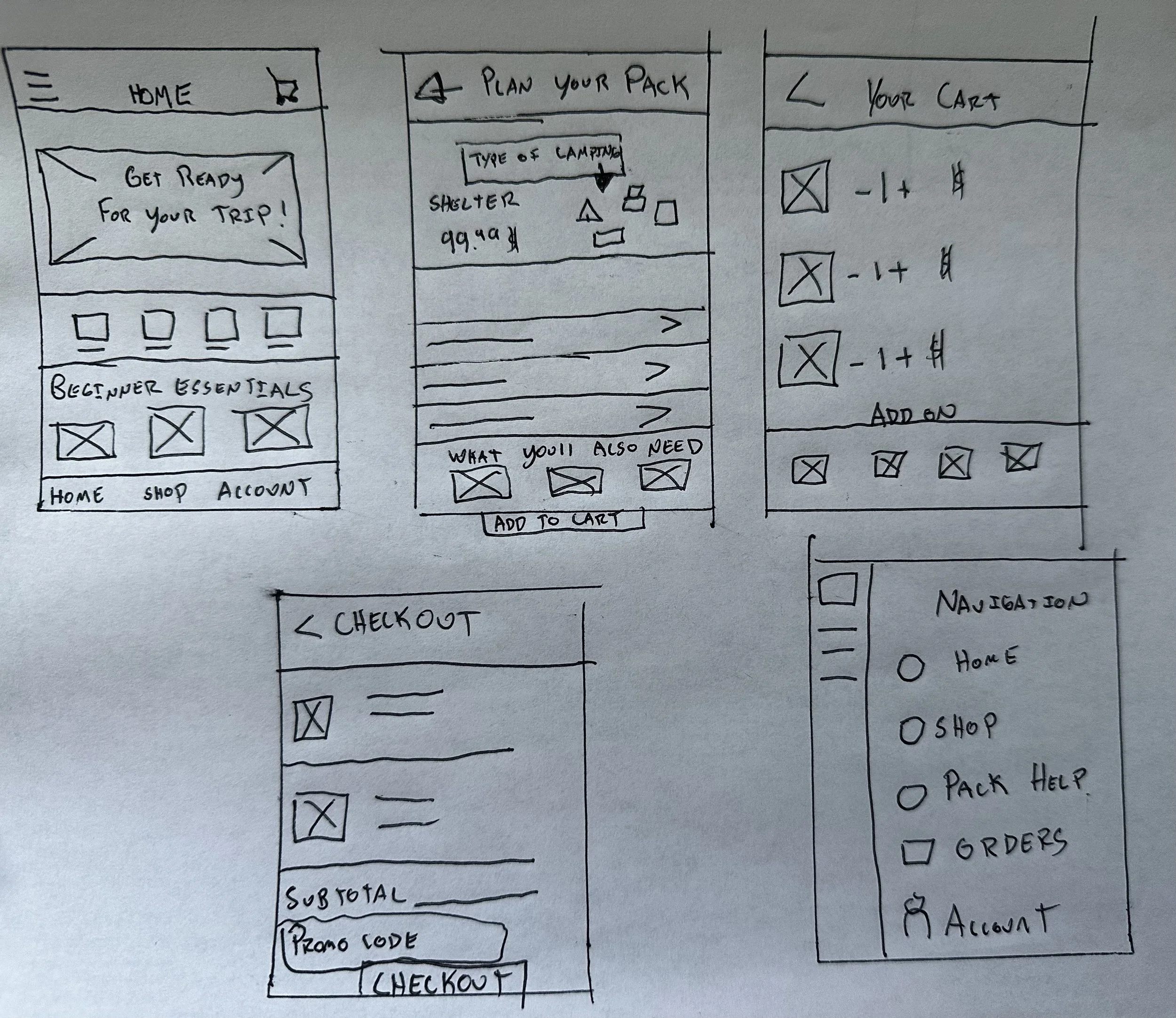
Prototype & Testing
A low-fidelity prototype connected the quiz, bundling, packing list, checkout flow. I ran two moderated usability rounds to validate navigation, spacing, and action feedback before building final screens.
Before & After
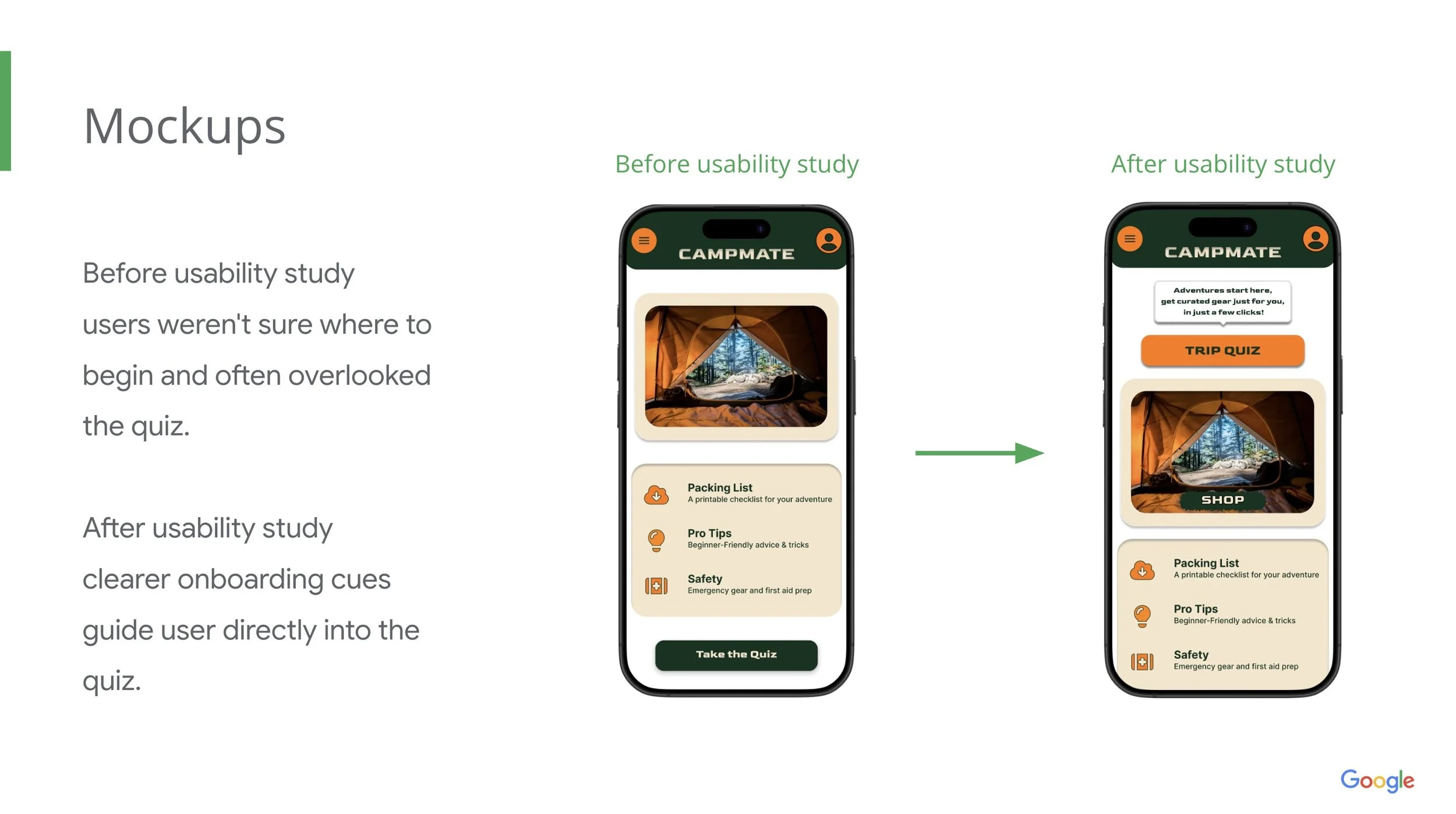
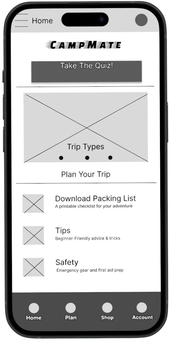
Pair A (Home screen)
Before: Users missed the quiz entry.
After: Clearer onboarding cues and larger CTA increase discoverability.
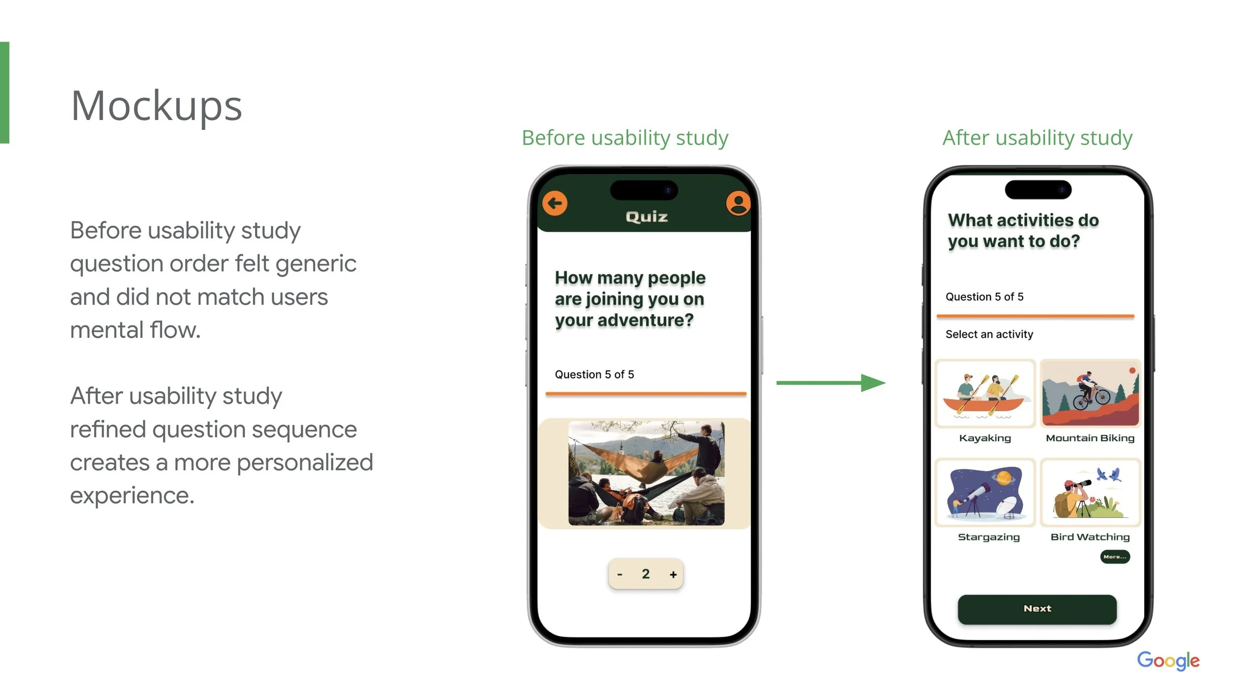
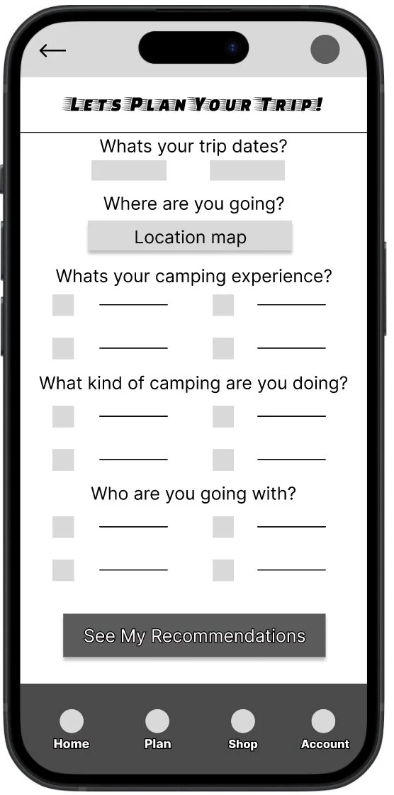
Pair B (Quiz flow)
Before: questions order felt generic.
After: Reordered questions for personalized results.
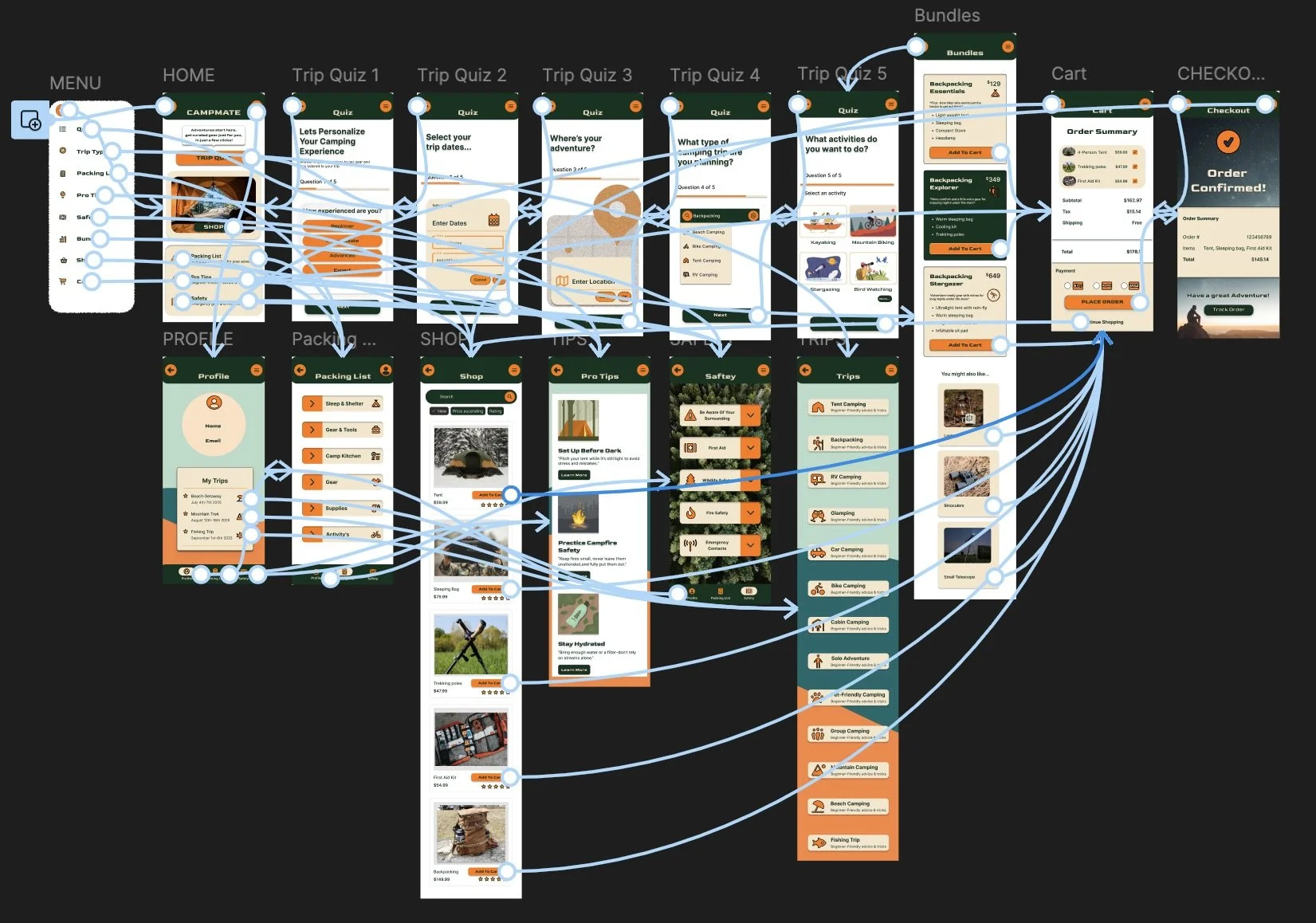
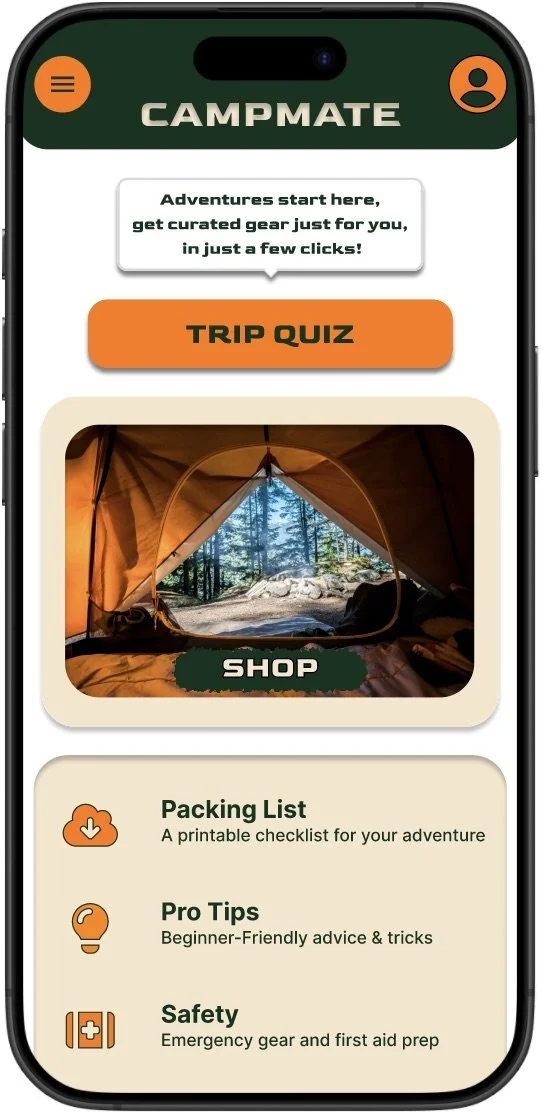
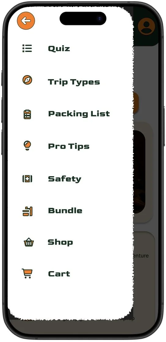
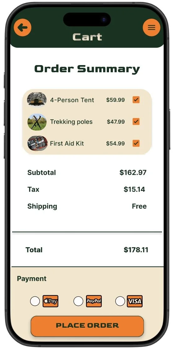
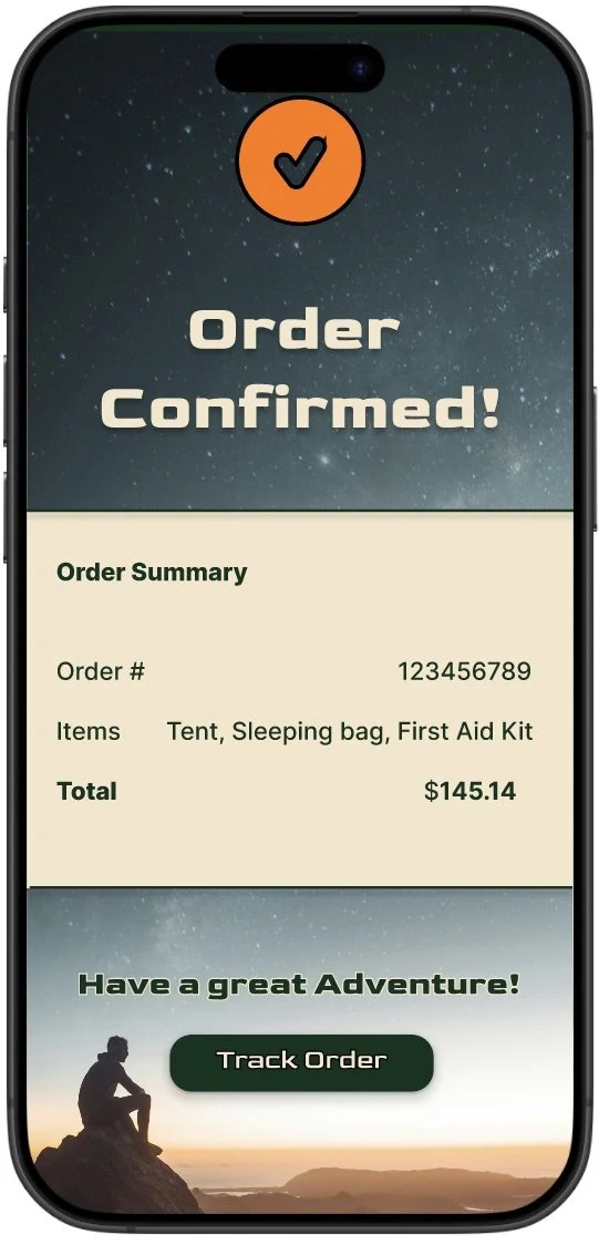
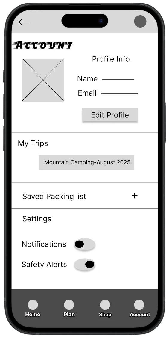
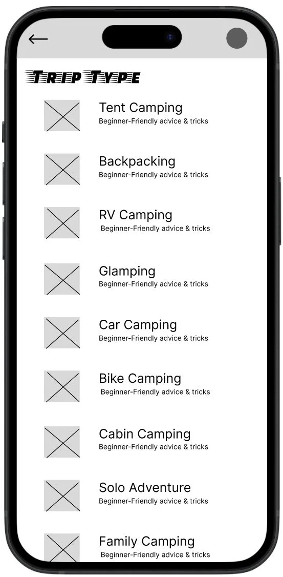
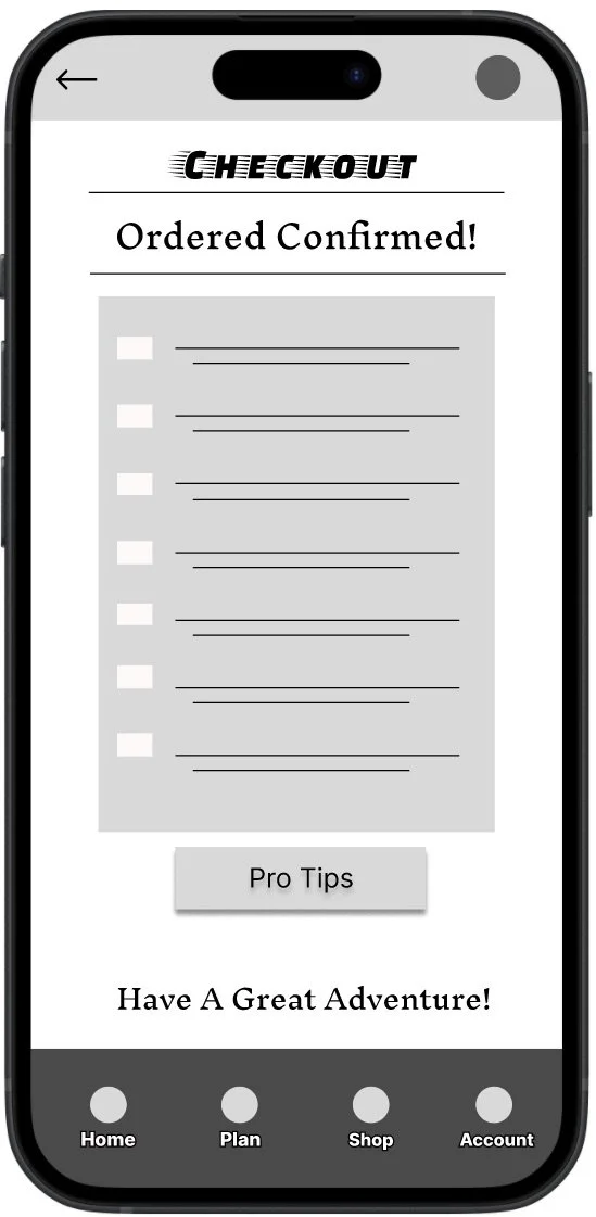
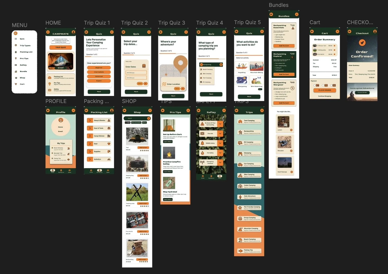
Final screens
high-fidelity screens showing the final CampMate experience from onboarding to purchase confirmation.
Accessibility & KPI’s
KPI’s to track
Task success rate (quiz, add to cart, checkout)
Time on task for packing list creation.
SUS score (pre/post iteration).
Misclick/ mistap rate on mobile.
Accessibility considerations
Increased spacing and larger tap targets for mobile accessibility.
Improved contrast and readable typography for low-vision users.
Simple language and familiar icons for cognitive accessibility.
Takeaways
The iterative research and testing reduced confusion and increased user confidence - the quiz and packing list were well-received; clearer navigation and feedback were critical fixes.
Next steps
Refine quiz phrasing and personalization.
Add bundle customization & product comparisons.
Run accessibility testing with users with disabilities.
Conduct a diary study to understand trip planning over time.
Lets connect!
Email: Chelsaefigge@gmail.com
Portfolio: Chelsaelaynephoto.com
LinkedIn: Linkedin.com/in/chelsaefigge